A mobile-first website designed for a community of learners.
Role:
Project Manager, Researcher, and UX Designer

Overview
From finding a new personal hobby to professional development, there are endless reasons why someone wants to learn a new skill. The question many users face is where to even start with finding knowledge about subjects they are interested in.
Many begin to feel overwhelmed and unmotivated before even starting their learning journey due to how many resources are out there. By offering an aggregated list of resources, users will feel less overwhelmed and will be able to start learning sooner.
Tools:
Figma, Optimal Workshop
Duration:
10 weeks
My Research Goals:

Methods Used:
Know what those learning a new skill need and look for so that we can understand the type of resources they need.
Competitive Analysis
User Interviews
Know what users need to reach their goals and what holds them back from achieving them.
For my competitive analysis, I looked at platforms such as Skillshare, Coursera, Udemy, and YouTube. I looked at key features of each website, as well as the features that set them apart from each other. I also researched how information was structured and how users interacted with each other on the platforms. This helped inform me on key features to include on SkillShare and what users would find value in.
From the user interviews, the following user personas were made to guide the creation of EdSquad:
For my user interviews, I interviewed four individuals in their 20s and 30s. All were interested in furthering their professional and personal skills. From these interviews, the following pain points and patterns were determined:
Learning a new primarily revolved around job advancement
Frustration over knowing if learning materials and their reviews were “legit” or not
Participants expressed wanting feedback and guidance from “experts” in the skill they were learning
Participants also expressed seeking out a community and wanting a chance to interact with others
I based my personas on my user interviews and the reasons expressed why they are learning a new skill.
This included:
Improving upon a hobby
Changing a career
Taking the next step in their career
With my personas made, I used these to help me in planning my features, task flows, and overall design and visual aesthetics,
Before I started sketching and designing my wireframes for EdSquad I created the following task flows the user might go through to complete actions on EdSquad. These task flows would later be some of the flows I would use during user testing.
Let’s start sketching!
I created the following lofi and midfi wireframes to sketch and plan what EdSquad would possibly look like. My approach for my wireframes was to create something visual pleasing to display a lot of information and detail to the user.
I started sketching the various low fidelity wireframes. I played around with different layouts and designs.
My key screens included the following: home page, group view, learning resources page, and view of groups joined.
The next step was to fine-tune my favorite frames and turn them into mid-fidelity mock-ups.
I took my strongest and favorite lofi wireframes and added more detail to further build out the layout of each page. This included building out buttons and their sizes, adding text and titles, as well as mocking up each page’s content.
I wanted my mid-fidelity frames to be as close to high-fidelity as I could. This would make applying EdSquad’s branding easier.
Bringing EdSquad to life…
My next step was to create EdSquad’s branding and overall aesthetics.
Colors

Blue represents learning, inspiration, and wisdom.
Both colors are relaxing and energizing!
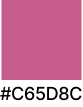
Mauve is used to help make the green pop.
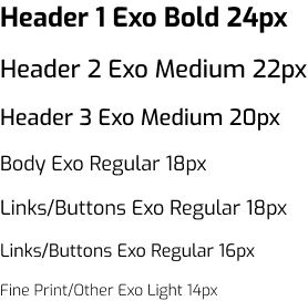
Fonts
Logos

The logo is made to look like two chat bubbles. This is to convey EdSquad’s main feature of connecting with others and learning together.
All these elements were brought together to create the following high-fidelity prototype.
This prototype will be tested with users with the goals of gathering feedback and testing various user flows for efficiency.

Green represents growth and personal development.
Testing Begins!
The next step was to conduct user tests. I conducted 6 tests with the following goals and success metrics.
User Flows Tested:
Signing up for EdSquad
Joining an EdSquad
Posting in an EdSquad
Searching for a class on EdSquad
Results:
What Worked:
Create New Post
Some UI tweaks will be made based on feedback from participants.
Join New EdSquad
Some UI tweaks will be made based on feedback from participants.
Goal: The goal is for users to successfully and efficiently navigate the specified user flows on EdSquad. The goal is also to gather user feedback on their overall experience as they move through each flow.
Success Metrics:
Tasks are completed efficiently
Tasks are made without any error
Feedback is given on overall experience
Overall, each user flow tested resulted in zero to little errors by participants.
What Needs Improvement:
Sign In/Sign Up Page
A larger sign-up button, or a separate sign-up area
Search for Class/Resources
Add an option to search from the home page
Final Product
Based on feedback from user testing and other stakeholder feedback, iterations were made to the final EdSquad product.
View final EdSquad prototype here.
In conclusion
I am very proud of myself for completing my first end-to-end project. Overall I am very satisfied with my research, the end product, and how users found it during testing.
Having done market and user research in my previous marketing jobs, I found the research process very familiar. I also found it was an area in the design process I felt the strongest.
Looking forward to upcoming projects, I would like to spend more time exploring different design ideas in order to further push my UI design skills.
Thanks for stopping by! You can check out more of my work below.